
The shift away from white and pale grey kitchens to earthy kitchen colours has been building for several seasons, and what has replaced it is a family of colours that share a common quality: they have been pulled back from their purest, most saturated form. These are not clean greens or true browns. They are greens that have been quieted with grey, browns that carry a hint of purple or green, reds that read more terracotta than fire engine. The shorthand for them, dirty colours, is accurate: they are tones that have been made more complex by mixing them with their complements or with neutral greys.
What makes these colours work particularly well in kitchens, beyond the aesthetic qualities that have made them fashionable, is their functional tolerance. A muddy olive cabinet door does not show fingerprints the way a white painted surface does. A warm brown does not reveal water splashes as readily as pale grey. These are colours that work for the kitchen environment as much as they look good in it.
Undertones determine everything
The most critical specification decision when working with dirty kitchen colours is undertone identification and matching. Brown cabinets exist across a wide spectrum, from those that lean purple through those that lean red to those that lean green. Each of these sits in a fundamentally different relationship with the other materials in the space. A brown with purple undertones pulls towards cool-veined marble and unlacquered brass; a brown with green undertones works more naturally alongside warm timber and oxidised bronze.
The reliable way to test this is to lay physical samples of all the materials in the scheme, the cabinet paint swatch, the countertop stone sample, the floor sample and the hardware in the same light and observe the interactions. In the studio and on-screen, undertones are nearly impossible to judge. In the physical environment where the kitchen will actually live, they are immediately apparent.
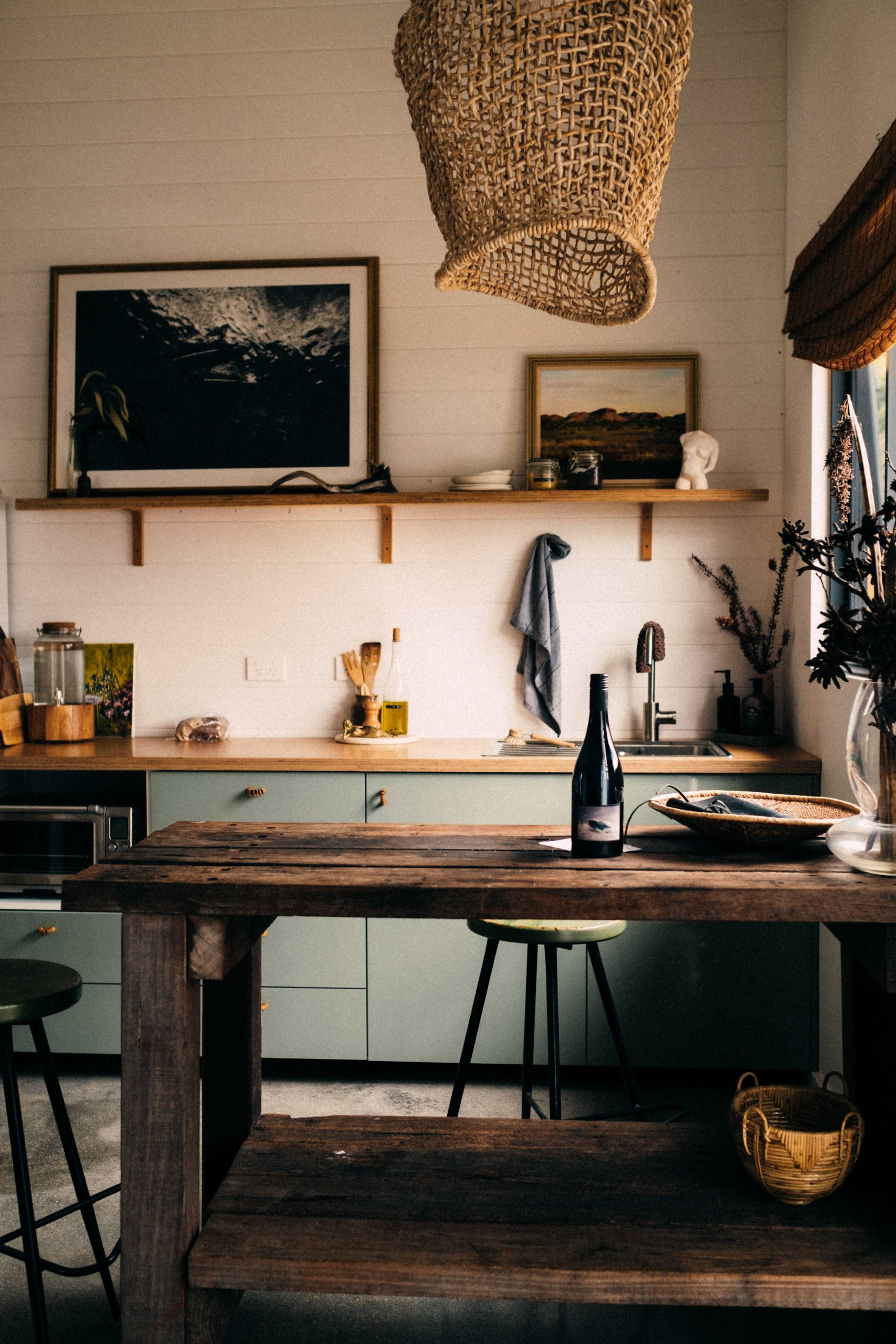
Texture plays as large a role as colour
A satin-finish cabinet in an earthy olive reads entirely differently from the same colour in a matte finish. The sheen level affects how much light the surface reflects and absorbs, which in turn affects how the colour reads across the day as light conditions change. Matte finishes absorb more light, making colours appear slightly deeper and more complex. Satin finishes introduce a gentle reflectivity that gives the colour more presence and lifts the overall brightness of the space.
Pairing contrasting finishes within a single kitchen scheme is where dirty colours show their most sophisticated quality. A honed stone countertop alongside satin-finish cabinetry alongside polished brass hardware introduces three different light interactions from three different surfaces, creating the layered visual richness that makes these schemes so compelling. Keeping everything in the same finish produces flatness, regardless of how carefully the colours are chosen.
Hardware: the decision that makes or breaks the scheme
Hardware selection is frequently treated as a final detail. In a dirty colour kitchen, it is a primary specification decision. Unlacquered or satin brass has a warmth that lifts earthy tones without competing with them, and it develops a natural patina over time that suits the lived-in quality these colours are designed to convey. Aged bronze or black iron both work strongly alongside muddy greens and warm browns. Polished nickel and chrome are harder to reconcile with these palettes: their cool, crisp quality creates a tonal discontinuity that rarely resolves comfortably.
Countertop selection
The countertop performs the most visible role of any horizontal surface in the kitchen and bears the most direct relationship to the cabinet colour. For earthy, warm cabinet tones, the most successful countertop choices are those that participate in the same colour story: marble with warm or neutral veining, stone with movement and character, engineered quartz in tones that carry some complexity rather than pure white or uniform grey.
A crisp brilliant white countertop against a warm dirty-colour cabinet creates a tonal jump that requires considerable resolution through the rest of the scheme to hold together. A slightly softer white, one with creamy or warm undertones, works considerably more naturally. The key question for any countertop choice is whether it belongs to the same temperature range as the cabinets: warm with warm, cool with cool, or a carefully mediated contrast that is deliberate rather than accidental.
Scale considerations
Not all dirty colours work equally across all kitchen sizes. Darker tones, deep burgundies, forest olives and dark earthy browns absorb light and visually compress a space. In a small or north-facing kitchen where natural light is limited, the same undertone in a lighter, dustier form- a clay, a mushroom, a soft khaki- delivers the same earthy warmth without the same level of light absorption. Smaller kitchens generally perform better with the lighter members of this colour family. Larger, well-lit kitchens have the volume to absorb the darker tones and still read as generous.
Also See: How to remove black mould from silicone sealant
This article was written by Jade McGee for Garden and Home.


